

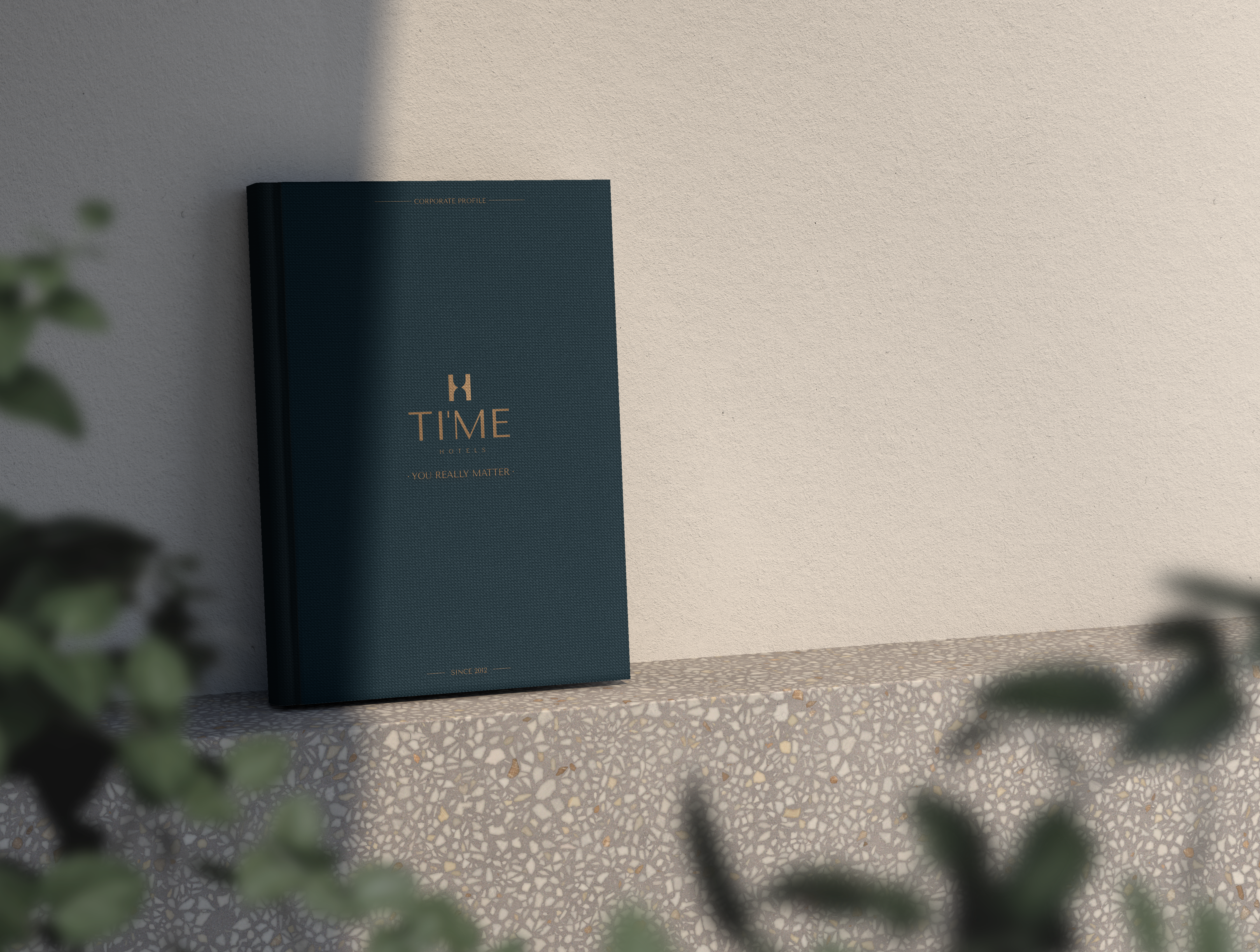

TI’ME Hotels Rebranding
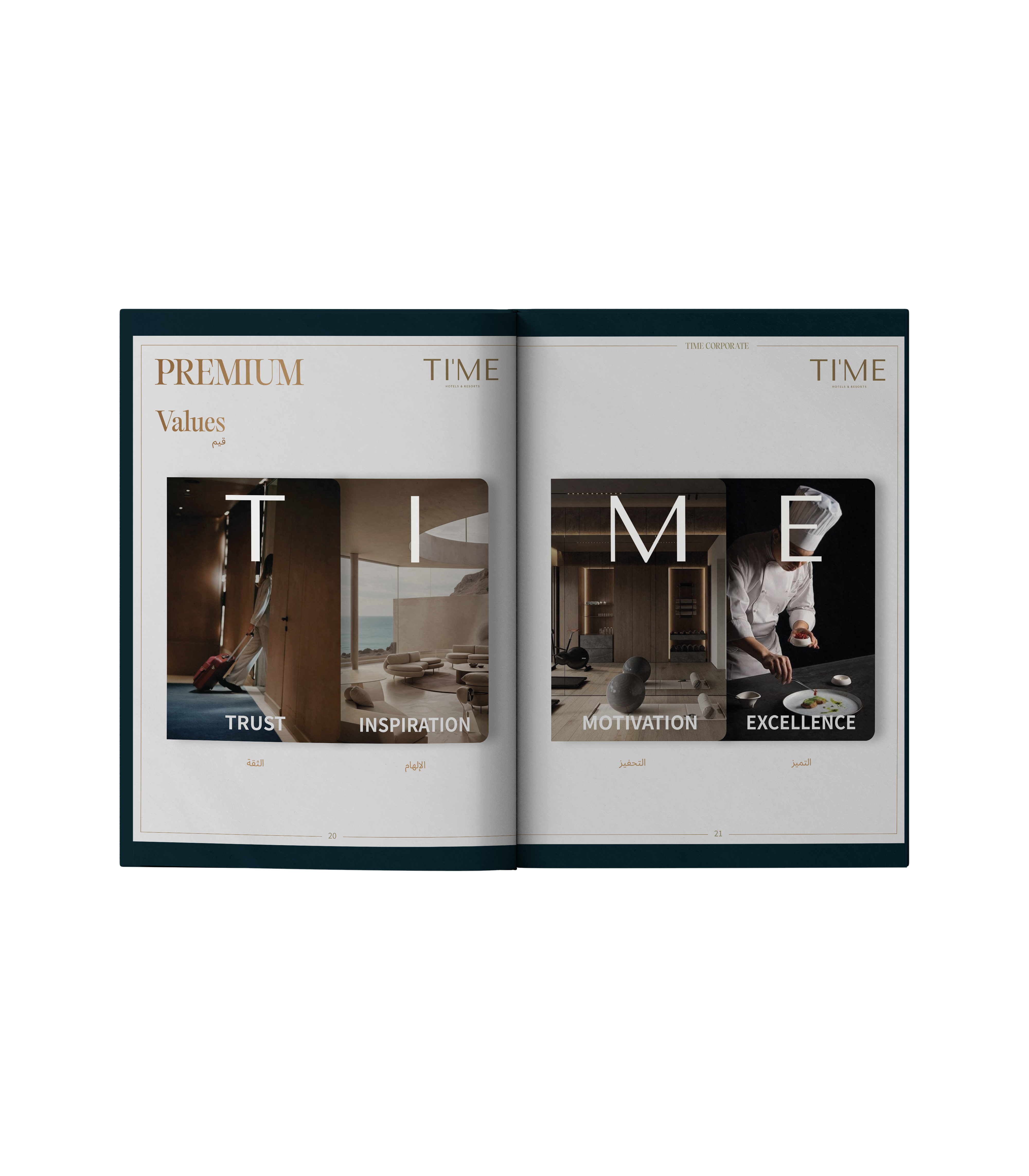
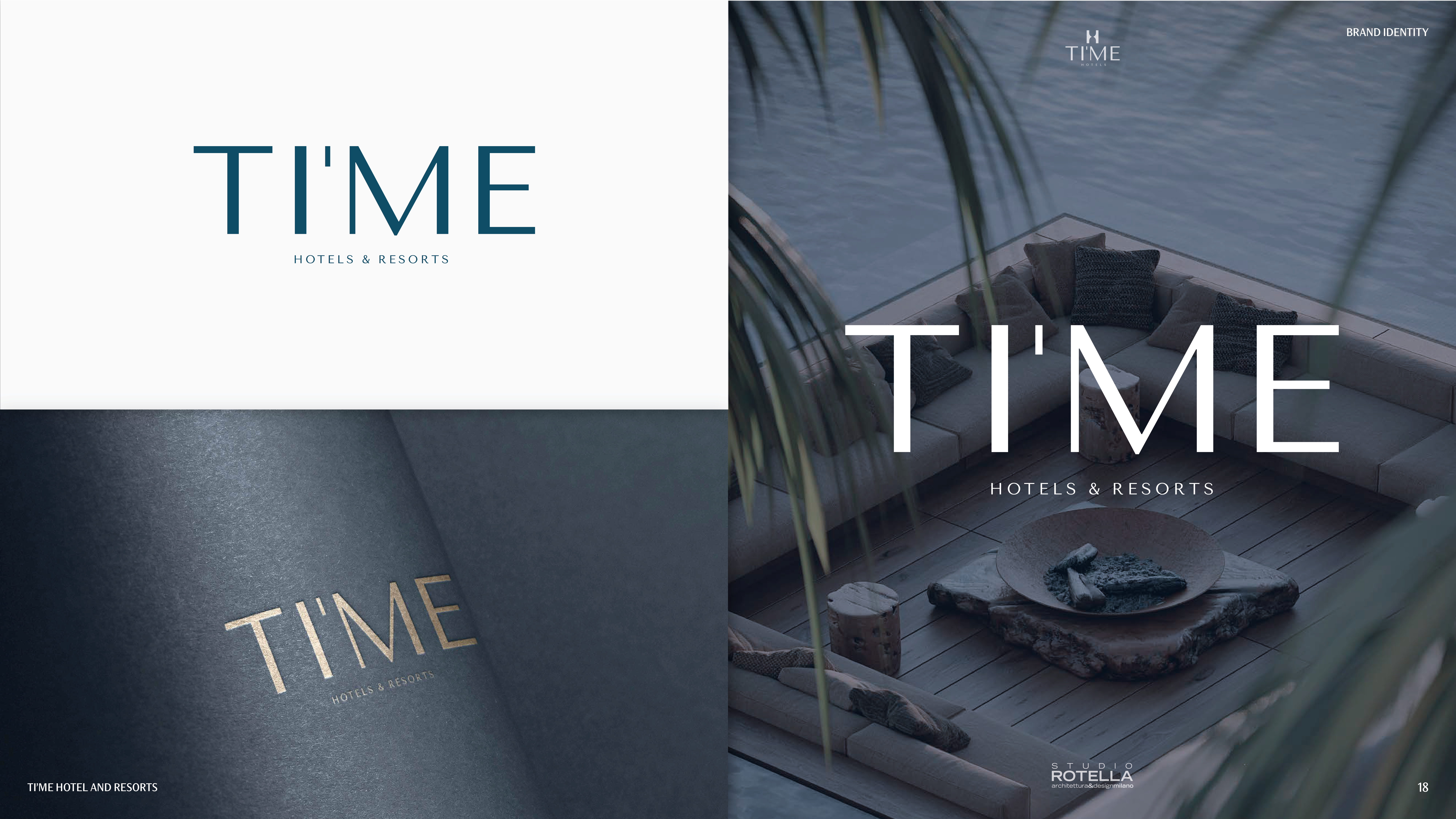
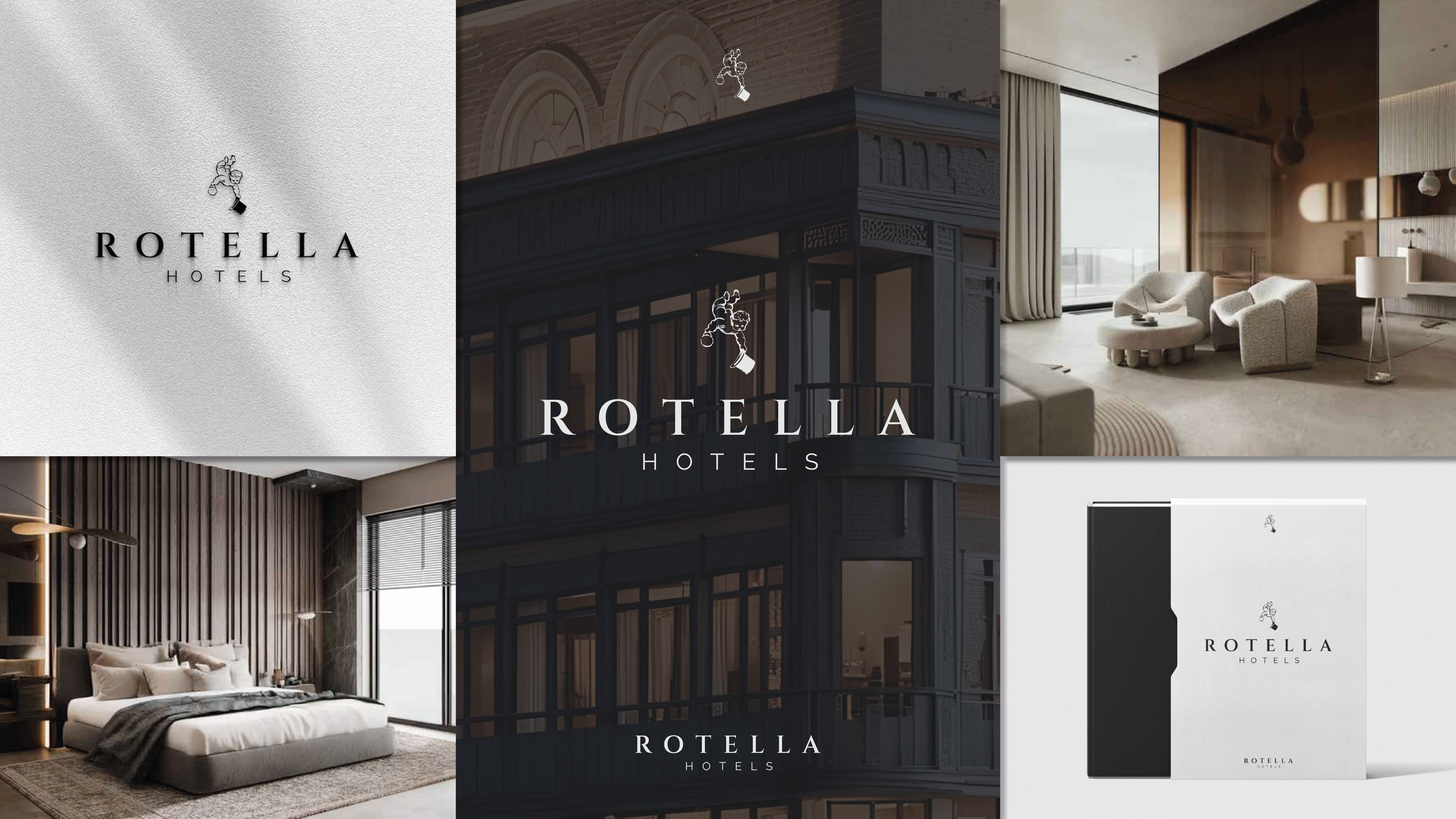
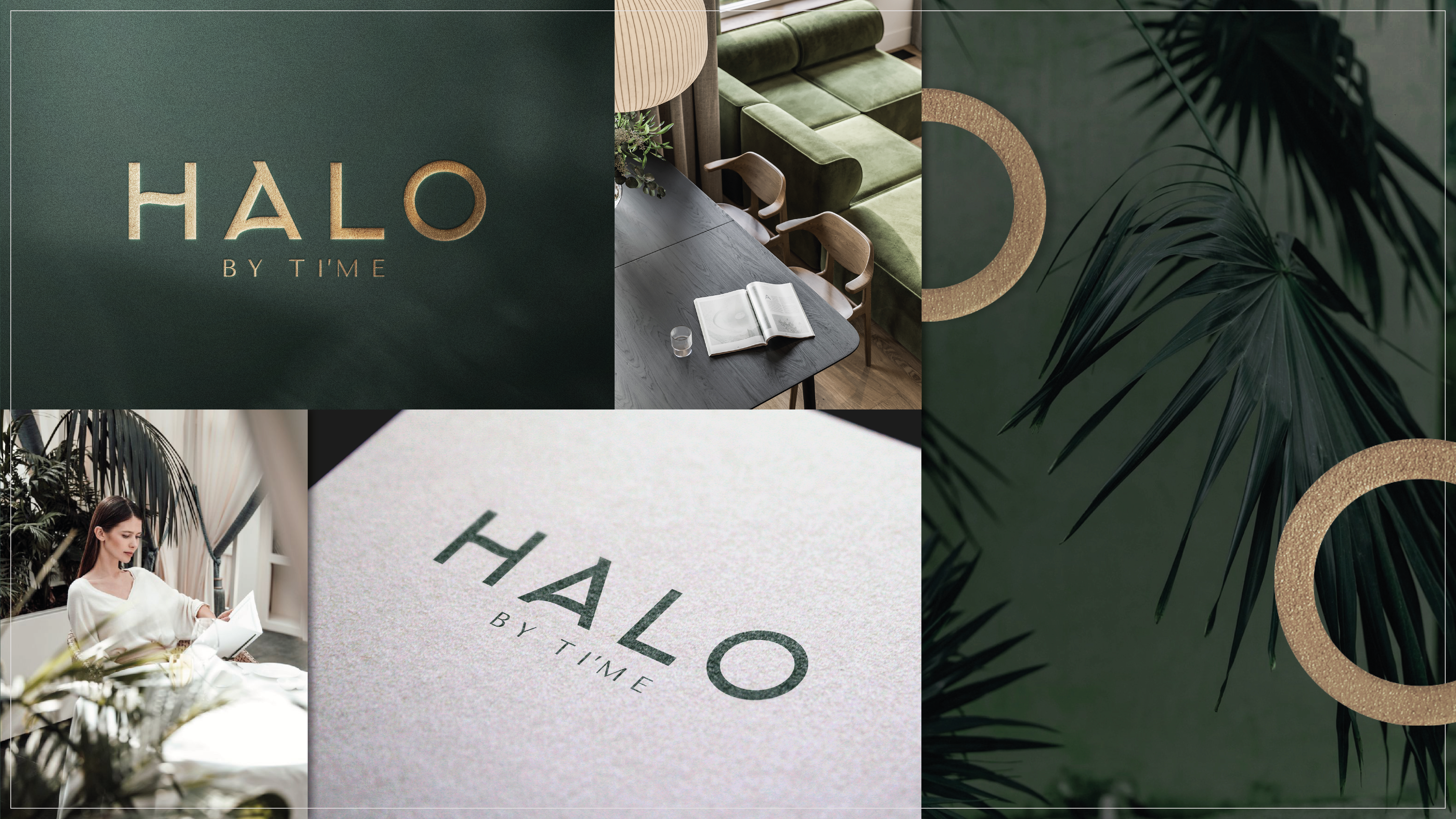
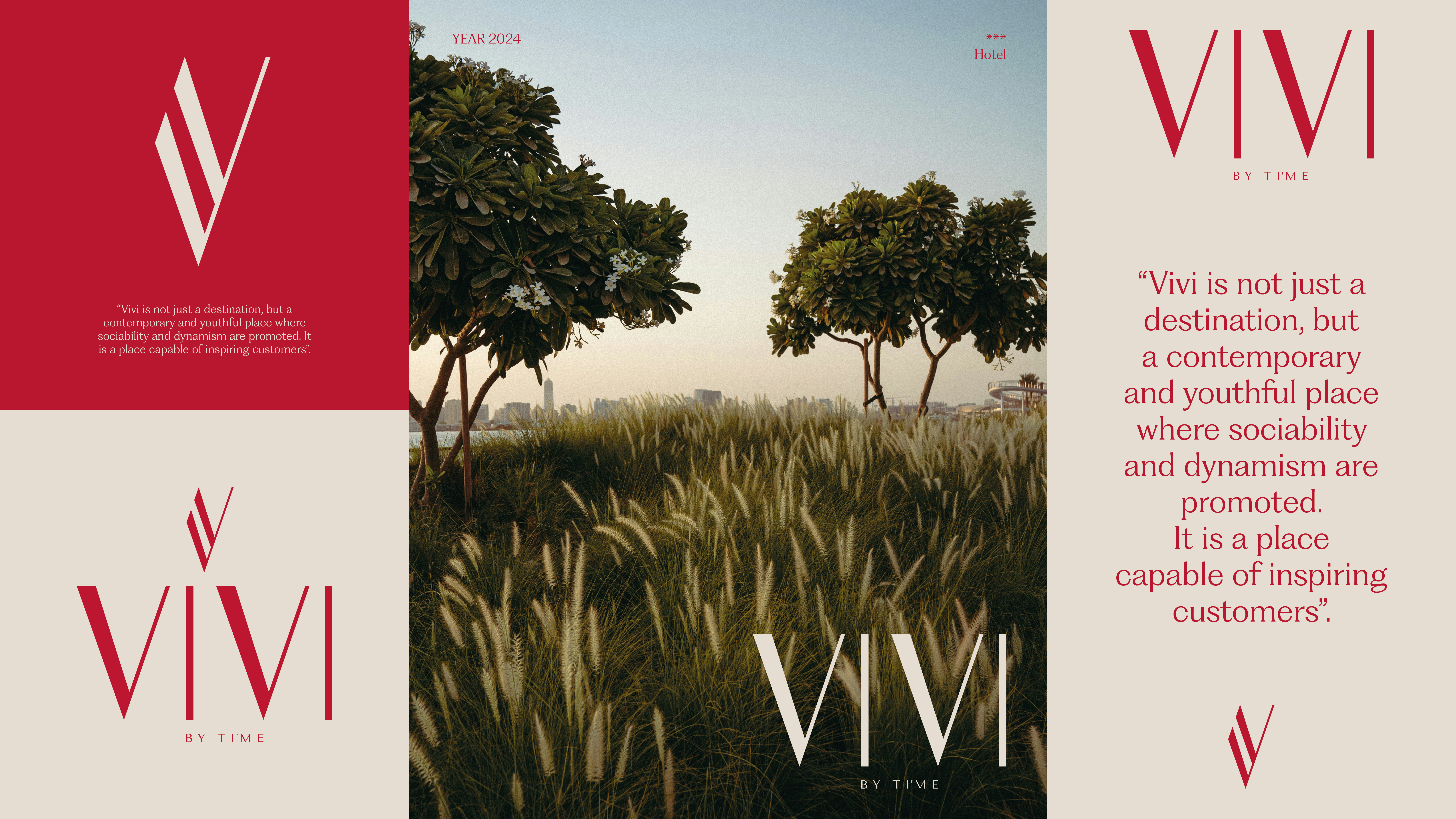
The rebranding of TI’ME Hotels was driven by the need to update its visual identity and strengthen brand recognition on a global scale. The project began with an in-depth analysis of the market and the brand’s core values, which led to a new strategic positioning: the “Oasis of Well-being”—a space where time becomes meaningful through authentic and relaxing experiences. At the heart of the project was the redesign of the logo, envisioned as a symbol of the passage of time. The new graphic mark conveys a contemporary, elegant, and distinctive character. Alongside the logo, a complete visual system was developed, including a natural, oasis-inspired color palette, refined typography, usage guidelines, and applications across various touchpoints. The visual identity of TI’ME Hotels’ sub-brands was also redesigned. Organized into six distinct offerings—ROTELLA, TI’ME, HALO, VIVI, EXPRESS, and RESIDENCES—each sub-brand was shaped to meet different audience needs while remaining part of a cohesive and unified brand ecosystem. The project was completed with a full set of graphic applications across institutional and communication materials, supporting a renewed, coordinated image that reflects the group’s evolving vision and international ambitions.